Color harmony at the table
Tell me what color you are and I'll tell you which tableware is right for you!
Today we're talking about color harmony applied to the table.
Because, in a sense, plates are the "clothes" of our table, along with the tablecloth and the rest of the mise en place. When we set the table in the dining room, living room, lounge, or kitchen, we certainly don't want it to clash with the furniture, rugs, and wall colors, right?
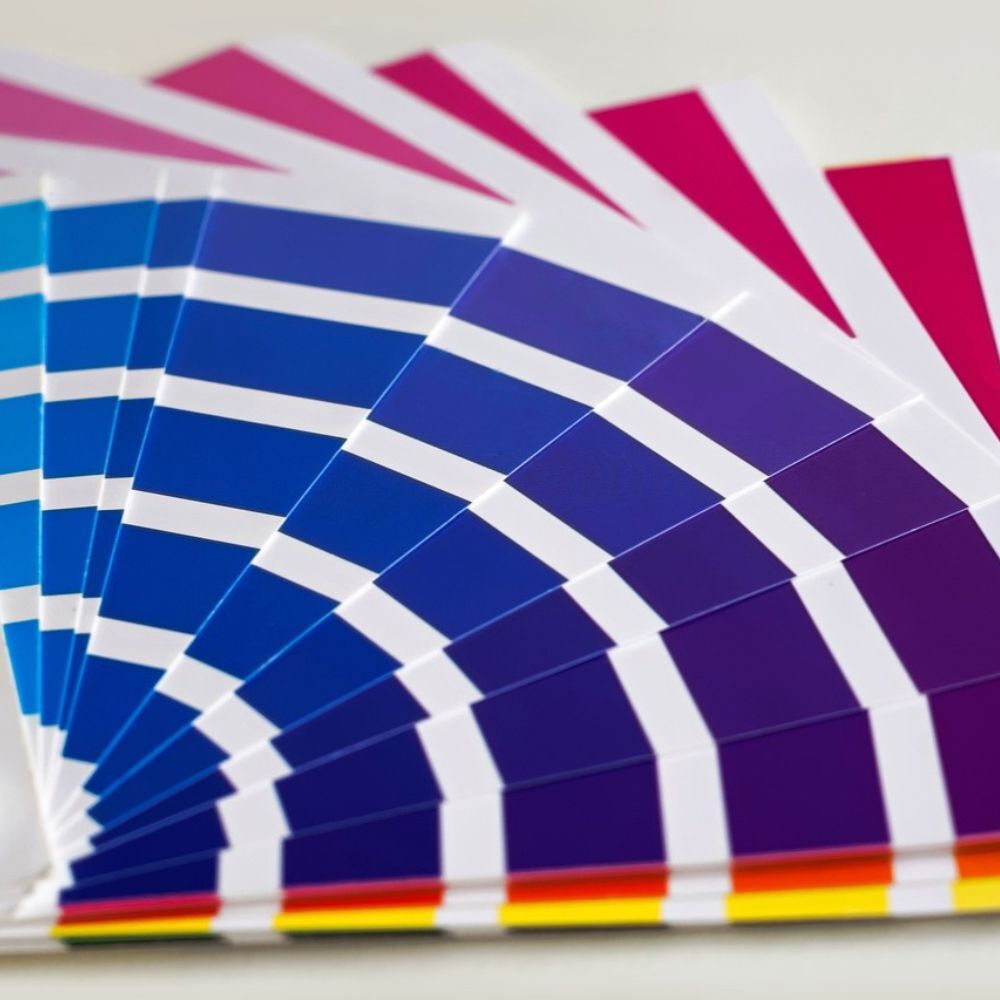
So, let's start with the basics and first understand what color harmony is all about and see which shades go well together, so we can use them in our everyday lives with a touch of creativity.
Color harmony is a color analysis now well known to the public thanks to the hype on social media and in magazines, as it allows you to better understand your own "palette" of shades to enhance your complexion and hair based on your "seasonal color."
In fashion, based on hair, eye, and skin color, four seasons are identified—spring, summer, fall, and winter, with internal variations in intensity—from which to choose makeup or clothing in specific shades that enhance the face and body. Color is thus adapted to the characteristics of each individual and helps to create a clear path of choices so that you can have a complete wardrobe with no margin for error. No more moments of despair asking yourself, "What should I wear now?"
Let's go into more detail and see how to integrate color harmony from clothes to the table...
- Spring
Those who fall into the Spring color harmony season tend to have a radiant complexion, light and bright eyes, and wheat-blonde, golden brown, or red hair. Recommended colors are warm and vibrant, such as peach pink, light blue, coral, salmon, yellow, and variations of orange. In home décor, Spring is reflected in neutral-toned furniture in light wood, combined with accent colors such as navy blue and all warm colors.
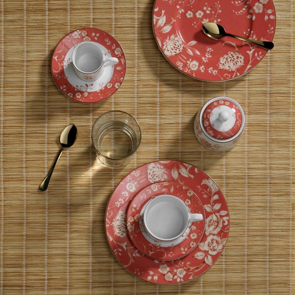
On the table, our Heritage Coral tableware is the perfect inspiration for a total Spring look.
- Summer
Summer friends can be recognized by their light eyes (from blue to hazel), blonde hair (or at most ash brown) and diaphanous, delicate skin that is not very reactive to the sun. Their colors are all those that come to mind when we think of the season: marine tones, natural tones, from shell pink to slate blue, passing through lilac, light blue, lagoon green, and straw yellow. Soft shades for an ethereal palette that, even at home, translates into neutral, sand or taupe furnishings, paired with floral decorations and pastel colors. At the table, our Cottage line is perfect for creating a colorful and imaginative, yet delicate mise en place.

- Autumn
Those who belong to the Autumn category can boast an amber complexion all year round - unlike their Summer counterparts - and have darker eyes ranging from green to hazel and brown, as well as hair that can also be mahogany or deep red. The colors of the Autumn palette are the warm, deep colors of a forest on an October day, amber and gold, inspired by the changing earth and spices: from brick to mustard, olive green and whale blue to beige and brown. In the Autumn home, warm colors and browns are given free rein, but also dark green and mustard yellow, on a beige or ivory base. Earthy colors also make their way onto the table with our new Sicilia porcelain tableware, with its unique and striking decoration, created from a design executed entirely by hand.

- Winter
Finally, Winter people are characterized by fair skin contrasting with dark or olive hair. Their eyes are generally dark, but there are exceptions, with hair ranging from brown to raven black. The colors of the Winter palette are cool but bright, deep, and contrasting: red, orchid, midnight blue, and cobalt blue, white, emerald green, but also a striking lemon yellow and even gray. For the home, the starting points are white, gray, or taupe, which can be combined with black for a minimalist style or with yellow, blue, or fuchsia to add a touch of accent. On the table, set with an elegant white tablecloth, our Firenze tableware stands out with its bold dark blue brushstrokes finished with real gold thread: a true touch of class.

In short, once we have established which season we belong to, we can indulge in shopping not only for clothes, but also for home and table accessories, to create comfortable environments that reflect our personality in every way, without making mistakes in colors and shades, for stylish details that will amaze our guests.